knytt
brand style guide
Welcome to the Knytt branding and assets guide. We want to make it as easy as possible for you to implement Knytt while still respecting our brand and everything it represents. In using these resources, you are also accepting our Privacy Policy as well as our Terms and Conditions Agreement.
logo & icon
Below are the official Knytt logos in order of primary and secondary. Usage of each is dependent upon the space being provided, as our primary logo is much more suited for shorter spaces, where the secondary is better used in larger, more open spaces. A wide variety of colors can be used for these two logos, but the color choices must follow the color guidelines that are detailed later in this brand guide.
To ensure that the integrity of the brand is not compromised, and that our logo always remains looking excellent, it is imperative that it be used in accordance with the guidelines to follow. Our logo consists of a modern lettermark and a wordmark. The icon is capable of being displayed independently, however the wordmark is not, and is always accompanied by the icon.
The Knytt icon and wordmark is a design that was inspired by the brand name. The sewing needles and the thread in the icon are tools that classically were used to knit clothing. In our company our mission is to knit groups, communities, people, and more, together for ease of communication and connectivity. Our logo's icon is also arranged to represent the first letter in our brand name and our "t's" in the wordmark also have combined cross strokes, deepening this idea of connectivity.
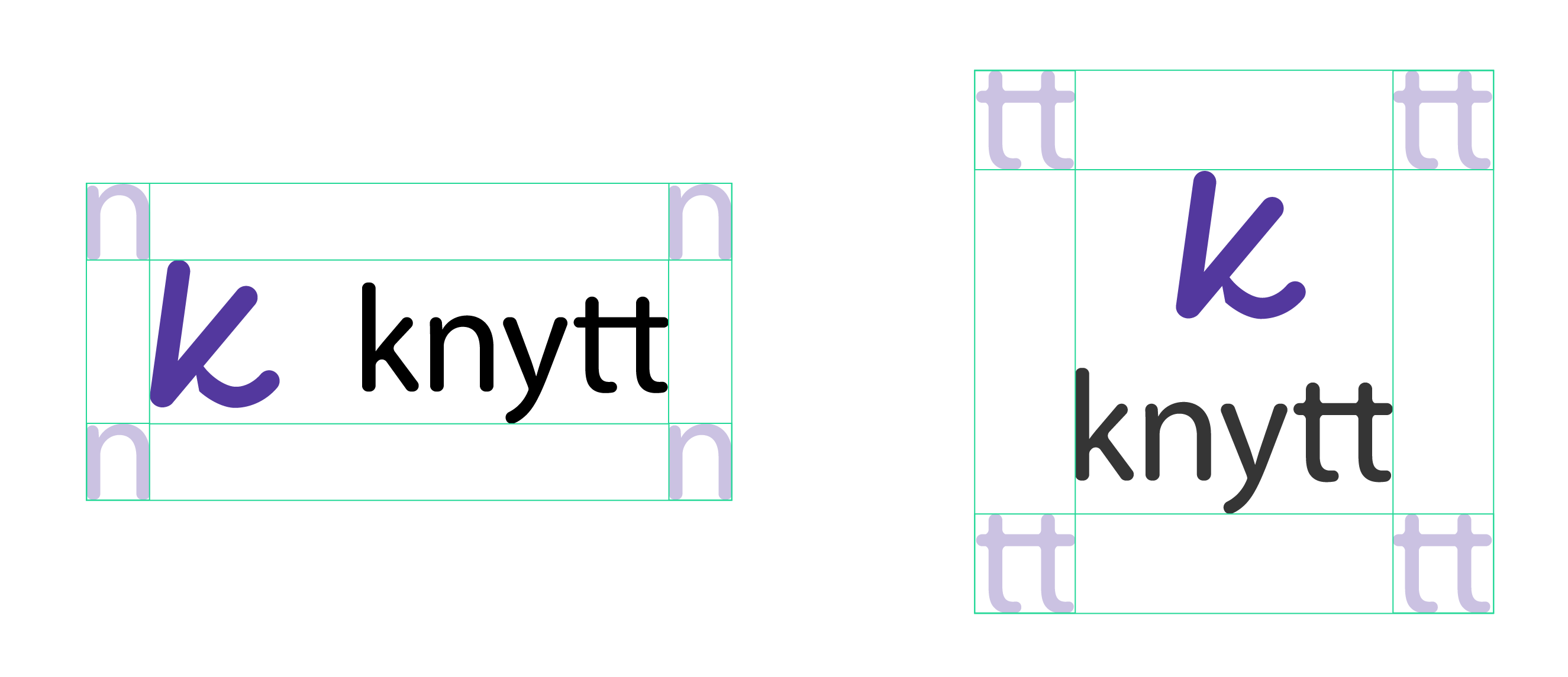
exclusion zone
The exclusion zone describes an area that nothing may enter. For the Knytt primary logo, this is defined by the height & width of the "n". For the secondary, it is defined as the height & width of the combined t's.
minimum size
To maintain the integrity and legibility of the logo in application, it must never be displayed smaller than the below specifications in digital or print applications respectively.


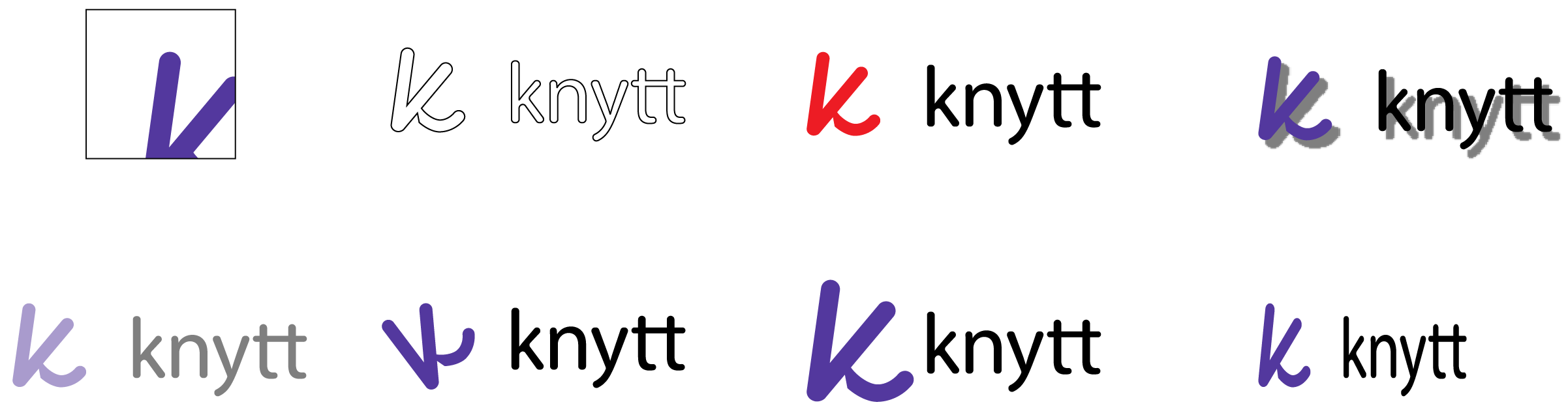
logo misuse
Below are examples of logo misuse. It's important that the Knytt brand maintain its identity and that the logo remain consistent and unwavering. No attempts at altering the logo or any part of the brand can be made in any way. Be it the colors, orientation, dimensions, or content, there are no exceptions to this rule.
colors
The Knytt color palette highlights the brands attributes of being friendly, energetic, high-tech, and adult. Knytt purple in combination with our orange and green are what make our brand come to life. Knytt's orange and green are commonly used for highlighting subtleties and actions and provide excellent contrast to both one another as well as our purple.
#53389E
#23D897
#FFB03B
#EDEDED
#060454
Our secondary palette, the dark blue and light grey, are used more quietly. These colors are usually meant to be used behind the scenes, and provide the additional contrast needed for our primary palette to really shine in the front. Our grey will often serve the same purpose as common white space without being aggressive, while our dark blue can serve varied functions, such as a web-link highlight color, or as a background as well.
color rules
Pairing Knytt's colors together appropriately is necessary for maximizing their effect. Note, that when using knytts colors in application, specific combinations must be maintained, and the law of the land is always contrast.
rules with logos
With the exception of occasionally using black or white, Knytt's icon is always one of its five colors, but in the vast majority of cases, we try to only use one of the three main colors. Knytts wordmark is always either black, grey, or in a very special instances, white or blue, in order to match a white or blue icon respectively). The background being used determines the color of the icon as well as the color of the wordmark, and usage is based on contrast. For example, If a light background is used, the icon should not be grey or white, and the same goes for the wordmark.. Inversely, if the background is dark the icon should not be black, blue, or maybe even purple, so on and so forth.
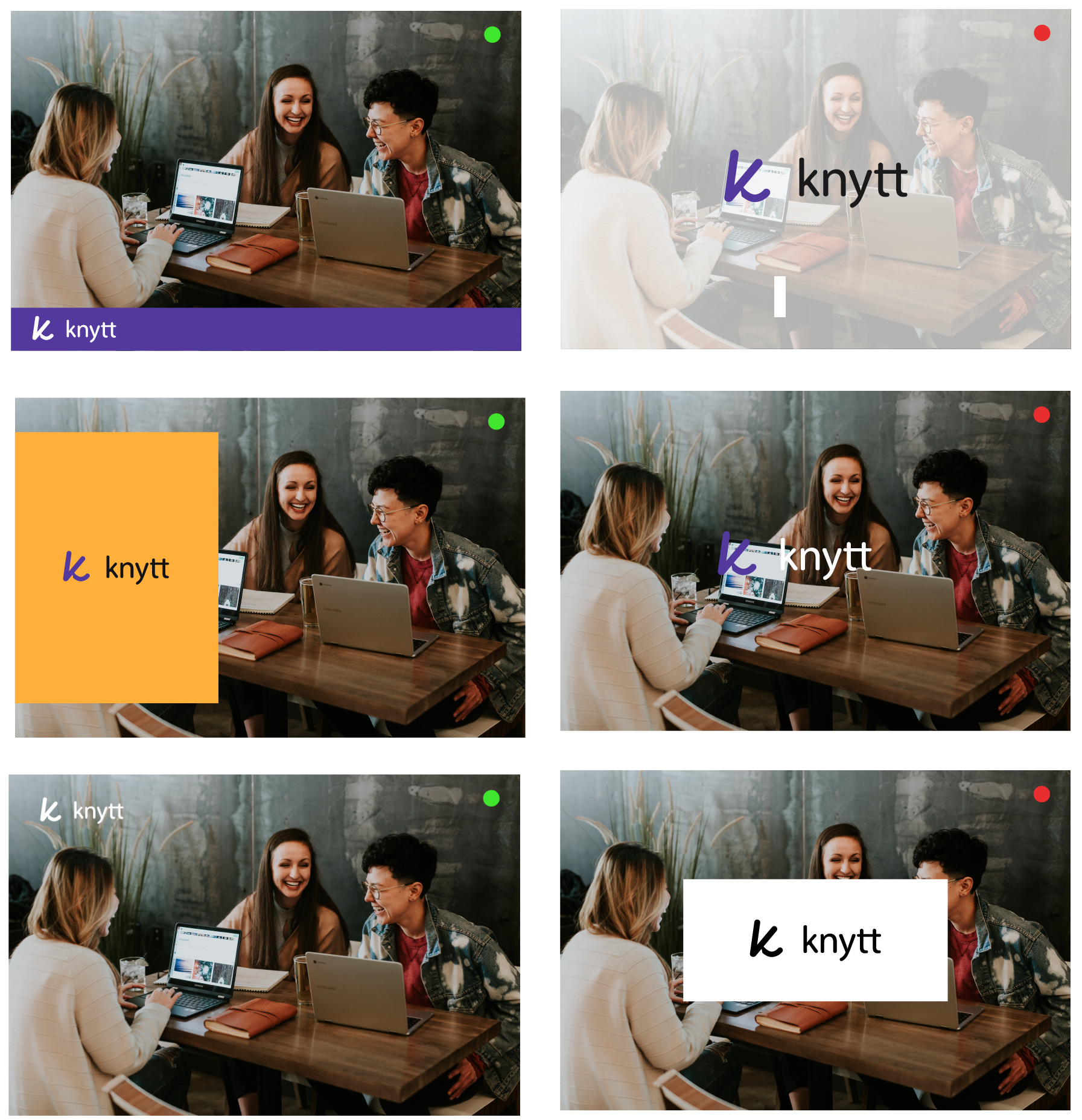
rules with backgrounds
The background being used behind our logo should always considered, as each icon and wordmark needs an appropriate contrasting background. The examples at the top of the page are some of our preferred combinations, and combinations with all five of our colors plus white and black can be used. As we stated above, the important thing is that the background being used provides ample contrast for both the icon and wordmark. If an image is being used as a background, as seen above, the logo must accentuate the background, and not be obscured by the image, nor obscure the image itself.
typography
Baloo Tamma 2:
A B C D E F G H I J K L M N O P Q R S T U V W X Y Z
a b c d e f g h i j k l m n o p q r s t u v w x y z
0 1 2 3 4 5 6 7 8 9
, . : ; " + - _ @ & % # ! ?
Roboto:
A B C D E F G H I J K L M N O P Q R S T U V W X Y Z
a b c d e f g h i j k l m n o p q r s t u v w x y z
0 1 2 3 4 5 6 7 8 9
, . : ; " + - _ @ & % # ! ?
Knytt utilizes "Baloo Tamma 2" and "Roboto" for all of its products and applications. The Baloo Tamma 2 font-type helps foster a slick and modern feel that is generally not used in paragraphs, and is more-so for things like headings and labels. Roboto on the other hand, is a more reader-friendly font-type meant for use in more textually-deep instances where legibility is key. It is important that this differentiation is understood if the brand is to be implemented and represented in other modes.
font size & weight
body size
The standard size for both print (pt) and digital (px) formats is 16 or 1em
heading size
Headings for both print (pt) and digital (px) formats (from smallest heading to largest) are to follow the Fibonacci sequence starting at 16. Then 24, 40, 64, 104, 168, and so on. On digital formats, these should be converted to em's.
font weight
Font weight in general should always remain at medium levels between 300-600.
font-backgrounds & font colors
font background color
For enhanced legibility, our grey color or a white should generally be used as the primary background color for all text. Our purple, blue, and orange would be the only other options. Generally orange would only be used in very small instances like buttons on apps or our website.
font color
For body text, the color of font should always simply provide ample contrast to the background. This said, we generally us black or occationally white or grey if in the instance a colored background is being used. In the case of an orange background, purple, grey, or white, text is appropriate. In the case of headings, similar to this guide, any font color can be used, so as it provides good contrast.
line height and line length
line height
Line Height for all publications should always equal the body font size x 1.25 - 1.5.
line length
Line Length for all publications should never exceed 100 characters. In fact, 60 - 80 characters is preferred.
paragraph & character spacing
Paragraph Spacing
The spacing between paragraphs for all publications should always equal to line height x 0.75 - 1.
character spacing
The spacing between all characters should simply always be set to 0 or 0em in most cases. Sometimes extending this can be ok as well depending on the application.
style & highlighting
style
We use lower-case fonts for all headings and maintain standard rules for most everything else. Another interesting thing we do occasionally when appropriate is use our brand name "knytt" as a verb to describe the actions performed when using our products... We call this "knytting", and is a fun way to express in-app usage and other actions our users take related to Knytt.
highlighting
We use a standard font style, unbolded & unitalicized for all-content. However this doesn't mean that the use of italics and bold-font is not allowed, instead these things can be used when deemed appropriate, and we feel they actually enhance communication when used wisely.
thank you!
We appreciate your respect and compliance in accordance with the content of this brand guide. Please reach out to us at support@knytt.us if you require clarification or assistance when implementing anything in this guide or related to Knytt or its products. We will be glad to help, happy knytting!